Exercise 5: Combining Visual and Metric Analyses in Artefact Interpretation
(Allow at least 1.5 hours for Exercise 5)
Two videos providing step-by-step guidance to Exercise 5 can be found from the links below.
| Part 1, Steps 1-7 | Part 2, Steps 8-13 |
Let’s say we want to consider the different manufacturing techniques used in creating the pottery from the Parker-Harris Pottery site and the Three Cranes tavern. We’ll want to combine both visual and metric approaches to consider the different surface treatments used on the potsherds from the dataset. In this exercise, you will learn to:
-
Take simple measurements from 3D models in CloudCompare;
-
Work with multiple meshes in the same project using multiple 3D view ports in Tile mode;
-
Employ all of the skills developed in Exercises 1-4 and combine visual and metric analyses to interpret 3D data to learn more about the pottery created and used at these sites.
-
Import the two .stl files for TC_23 and merge the meshes.
-
You may notice that, unlike some of the other sherds you’ve viewed, the surface of this vessel appears to have been brushed with some sort of tool. Unlike other potsherds, where parallel striations from the potter’s wheel were visible, the brushstrokes have created overlapping/intersecting groups of striations (see image below). Use the ‘Segment’ tool to isolate some complete, clear brush strokes. If you need to change the colour of the 3D model to see this more clearly, do so following any of the steps provided above, or choose ‘Colors’ from the Edit dropdown menu and ‘Set Unique’.
-
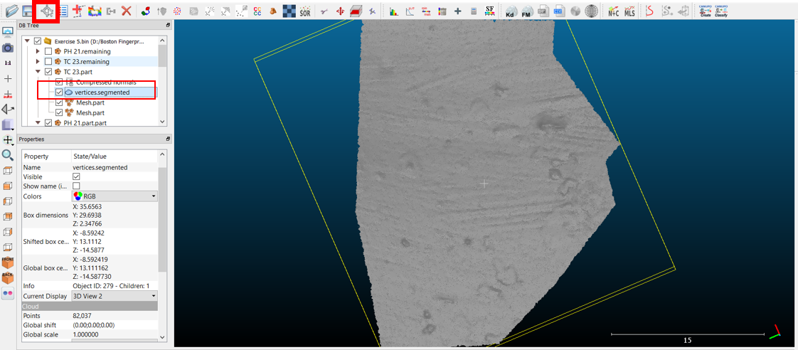
Point-to-point measurements are another example of a CloudCompare function that only works with the mesh’s vertices. Turn on the ‘vertices’ layer of your 3D model as you did in step 4 of Exercise 4 above. Highlight the vertices layer and select the ‘Point Picker’ tool (highlighted in red).
-
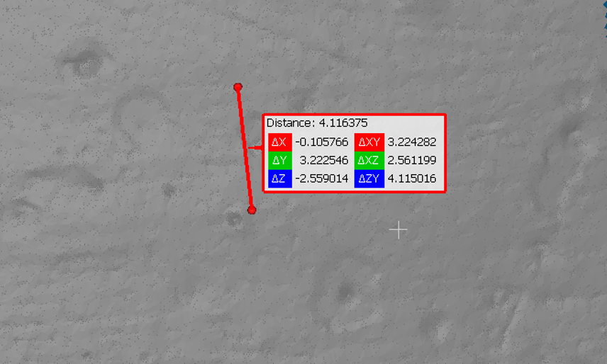
A new toolbar will appear in the top right corner of the 3D viewer – to measure between two points, choose the second icon, and then click in two places on the 3D model to measure the length of a feature.
a. Keep in mind that this is a straight line measurement – after you’ve created your line segment, you can rotate the 3D model to see if this cuts through your 3D model, or if it is roughly following the curvature of the surface of the potsherd.
b. As you can see in the image below, the brush stroke I measured is roughly 12mm long. Because this seems to be truncated by later brush strokes, what might be more useful would be measuring the width of the mark to see if the same sort of tool can be identified between different potsherds. Overall, on TC_23, it appears that the tool is somewhere around 4.1mm in width.

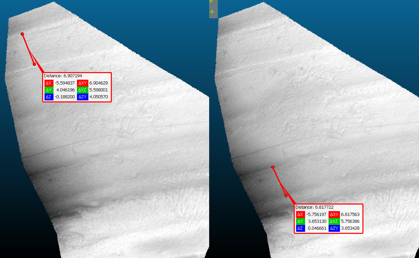
- Import some more potsherds and see how their surface treatment differs. I have chosen PH_21 for this next set of measurements – the surface is much smoother, and some sort of tool has been used to scrape/indent two ‘trailed’ bands across the vessel. Was it the same tool? If we compare the two measurements below, there is some suggestion that the same tool might have been used, but this is definitely a different tool than was used on TC_23. Perhaps PH_21 and TC_23 were two different types of vessels with different functions, or were they created by two different potters?
Note: You may find that choosing points of comparison relatively difficult in 3D. While not the most accurate way to measure these features, this does give us some further insight into this dataset and points to consider.
-
You may wish to compare two potsherds side by side in real time; this is useful because they will both be at the same scale in the same 3D space, and so some differences may become more obvious.
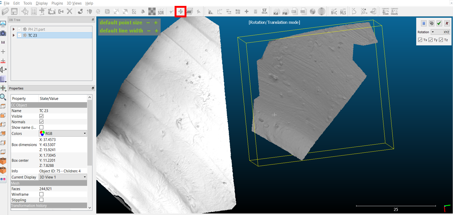
a. If you want to compare the two potsherds side by side in the same 3D viewer, highlight one of the meshes in the DB Tree, and select the ‘Translate/Rotate’ tool (to the right of the ‘Segment’ tool, highlighted in red below).
b. Holding down the left mouse button will allow you to rotate the selected mesh; holding down the right mouse button will allow you to move/translate the highlighted 3D model without moving the other 3D model.
-
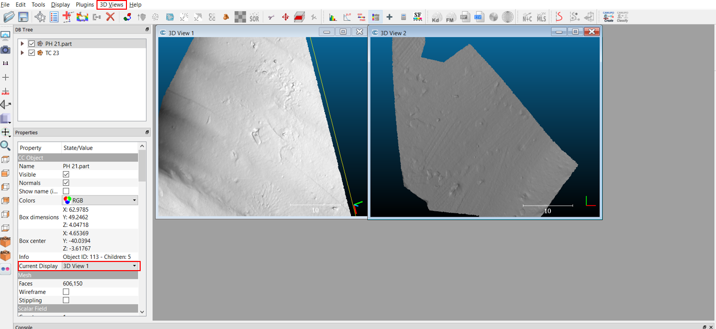
Recall that, if you want to allocate these 3D models to different 3D spaces, you can do this with the ‘3D Views’ drop down menu.
a. First, create a new 3D View. Then highlight one of the meshes in your DB tree.
b. Under its ‘Properties’, you can change its ‘Current display’ to the new 3D View window. If you want to view at the same time, from the ‘3D Views’ drop down menu, you can select the ‘Cascade’ or ‘Tile’ Options to view multiple 3D views at once. However, because they are in different 3D spaces, they will be at different scales.
-
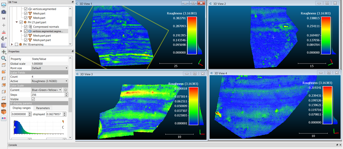
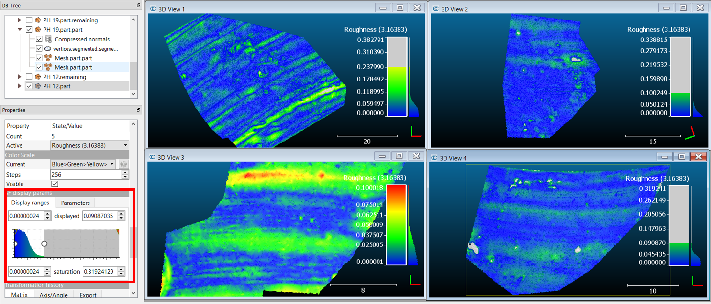
Instead of individual measurements, what if we used ‘Roughness’ as a method of characterising the different surface treatments? First, ensure that you have ‘segmented’ your meshes down to a relatively flat piece of potsherd that provides a good example of the sherd’s overall surface treatment. For this exercise, I imported the meshes of PH 21, TC 23, PH 19 and PH 12, but you are welcome to import any others that you found interesting during your own exploration of the archive.
-
Next, align your meshes and export the Z coordinates to their respective Scalar Fields.
-
Enable and highlight the ‘vertices’ layer for your mesh as you did in step 2 of this exercise. Then, under the ‘Tools’ drop down menu, select ‘Other’ and ‘Compute Geometric Features’.
a. Select ‘Roughness’ and set this at a consistent kernel radius throughout (in this case, I used 3.16383). Ensure that the ‘Color Scale’ is visible under each sherd’s ‘Properties’. If you put each of the sherds to separate 3D views and selected the ‘Tile’ option, your screen should look something like the below.
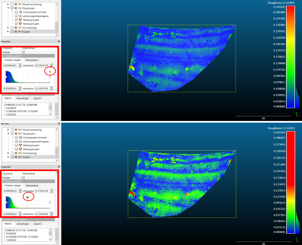
- You may notice that the visualisation of the ‘Roughness’ calculation also proves quite useful in visual characterisation of the manufacturing traces. If the automatic visualisation settings do not show many details, try editing the ‘SF display params’ for the sherd (highlighted in red boxes below). For PH 12, clicking and dragging the red triangle to the left (circled in red below) decreases the maximum saturation values of the Scalar Field and brings out the subtle striations typical of wheel-thrown pottery.
-
As you compare the Roughness values of your chosen sherds, you may notice that some are characterised differently from what you’d expect. For example, the maximum Roughness value of PH 12 is 0.319, closer in magnitude to PH 21 (0.382) and TC 23 (0.338) than PH 19 (0.1), though PH 12’s surface treatment appears quite visually similar to PH 19. This could be, in part, affected by outliers caused by post-depositional processes, like the pitting that appears red on the surface of the potsherd in the image above.
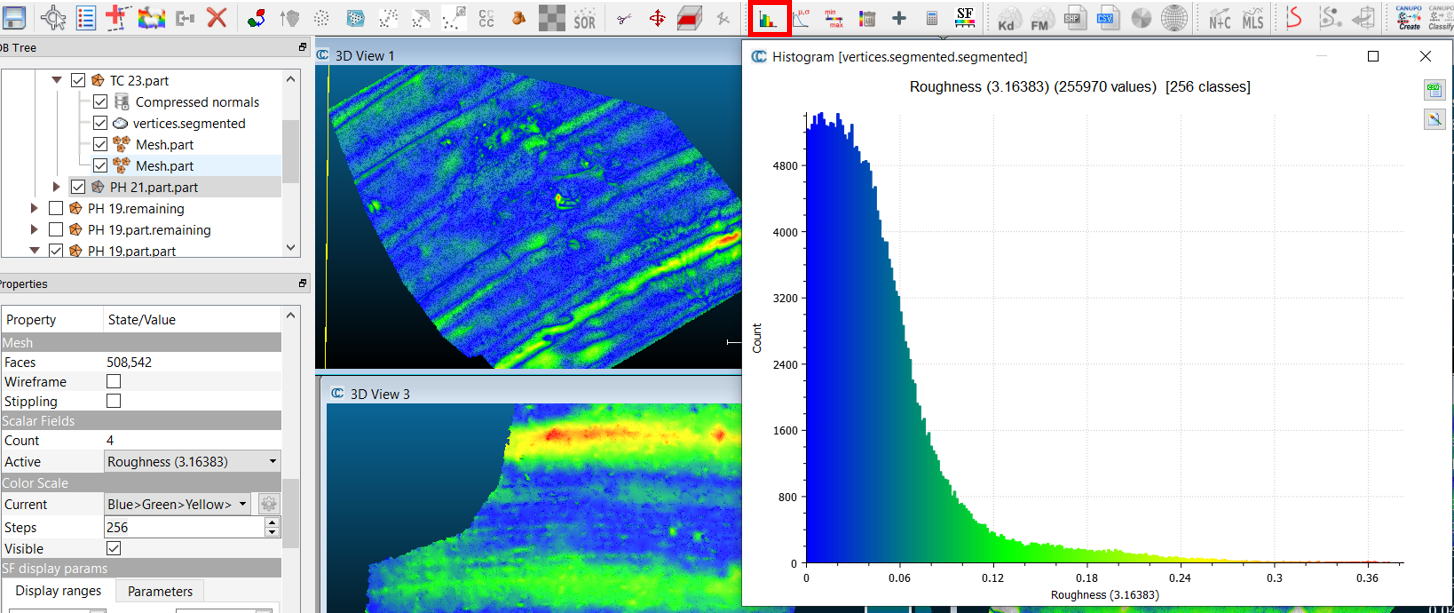
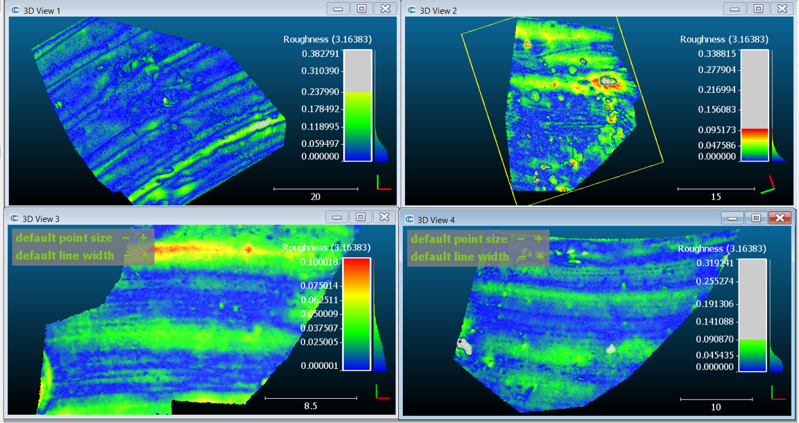
a. If we want to better understand the manufacturing process in relation to roughness, these outliers are not useful and should be excluded from our analysis. While the ‘visible color scale’ provides a summary histogram on the right, you can view a larger version by selecting the mesh and ‘Show Histogram’ (the toolbar icon is highlighted with a red box below). Because the PH 21 sherd is uneven (though mostly due to the design of the vessel form), the lower part of the sherd is causing a great deal of the roughness for this sherd. What level of roughness do you think is a reasonable characterisation of PH 21’s surface?
Outliers and Histograms
Outliers are points which, in this case, have a Roughness value that falls outside the normal range of the Roughness value for the majority of the other points in the point cloud.
A histogram is a diagram that graphically represents the quantity of points that fall within equal ranges with rectangles that increase in size as more points fall within that range.
-
Another way to deal with outliers is to work with the ‘SF display params’ as we did in step 11 of this exercise.
a. First, ensure that the downward-pointing arrows are at their initial starting positions on either side of the histogram. Now, drag the white circle from the far right side towards the left (this has been done for PH 19 in the red box below); you are decreasing the Maximum Scalar Values to remove outliers.
b. Watch the mesh as you do this – areas of extreme ‘Roughness’ should slowly turn grey. Continue to do this for each of the meshes until you are satisfied that the outliers caused by post-depositional processes are greyed out.
c. Now a more reliable comparison can be made between the ‘Roughness’ values of each sherd. You can also adjust the Saturation values as we did in Step 11 to enhance the visibility of the surface treatments.
Try it yourself!
- Open the histograms for each sherd; after removing the post-depositional outliers, how well does Roughness value distinguish between the different surface treatments you have observed?
- In the dataset shown below, PH 21 has an average Roughness of 0.23, TC 23 has an average Roughness of 0.1, PH 19 has an average Roughness of 0.1, and PH 12 has an average Roughness of 0.09. As expected, PH 21, with its deep decorative trailing and depressions, has the highest Roughness score, despite its smoothed surface in between. PH 19 and PH 12 also score quite similar levels of Roughness, as one might expect from their similar appearance. The only deviation from our expectations is that TC 23 scored quite a similar level of Roughness to PH 19 and PH 12 despite its ‘brushed’ surface treatment. While it is relatively distinctive visually, the relative depth of the brush strokes must be quite similar to the striations on the plainer sherds.
Reflect and Write! Calculate different morphometric parameters for each of your potsherds – are there any that distinguish between the different surface treatments quite well? Take a screenshot of the parameter that works best and write a short caption on why this is.
Two videos providing step-by-step guidance to Exercise 5 can be found from the links below.
| Part 1, Steps 1-7 | Part 2, Steps 8-13 |
| Back to Exercise 4 | Conclusion |